Style Guide
Color Outline
Your site colors
These are the main colors of your website. From each of the colors below are generated 6 shades from ultra-light to ultra-dark.
Main site Colors
Primary
Secondary
Accent
Base
Action
Complementary site Colors
Primary
Primary
Secondary
Accent
Base
Action
SHADES
Shade
Ultra-light
light
Medium
Dark
Ultra-Dark
Dark Color Section
Main colors with accents and shades
Pictures should be reflecting and working with your site colors.
Primary colors
Varying primary colors used with shades and accents.
Inverted Card
Inverting card colors can provide a fresh and modern look, making the design stand out and potentially creating a memorable user experience.
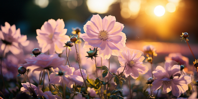
STANDARD CARD
Well-designed, cards can be visually appealing, making content stand out and drawing users in. They can also help break the monotony of continuous text.
ACCENT Card
Accent colors can help establish a visual hierarchy, guiding users' eyes through the design in a way that's logical and intuitive. Different shades or hues can indicate the importance or sequence of elements.
ACtion Card
Darker elements can draw the viewer's attention, especially in a design dominated by lighter tones. This can be used strategically to guide the viewer's eye to key information or calls to action.
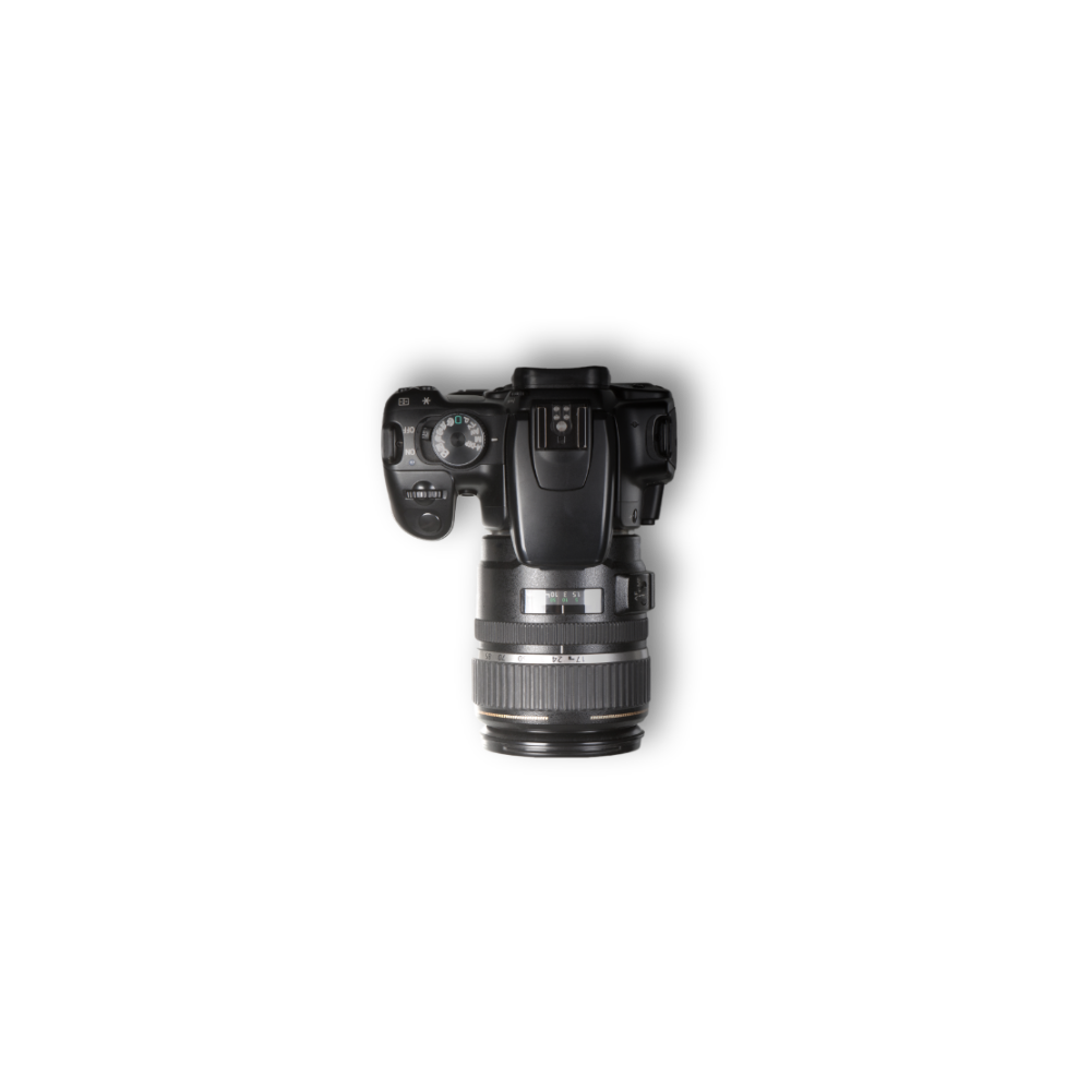
PICTURES
Allow pictures to blend in with the main site colors adding to brand and overall synergy.
Light Color Section
Main colors with accents and shades
Pictures should be reflecting and working with your site colors.

Primary colors
The logo, favicon, and sometimes the main header might use the primary color.
Inverted Card
If a website predominantly uses a light theme, inverted color cards can break the monotony and add some variety to the design.
ACCENT Card
Colors can evoke certain emotions or feelings. An accent color might be chosen because it evokes a particular mood that aligns with the content or purpose of the design.
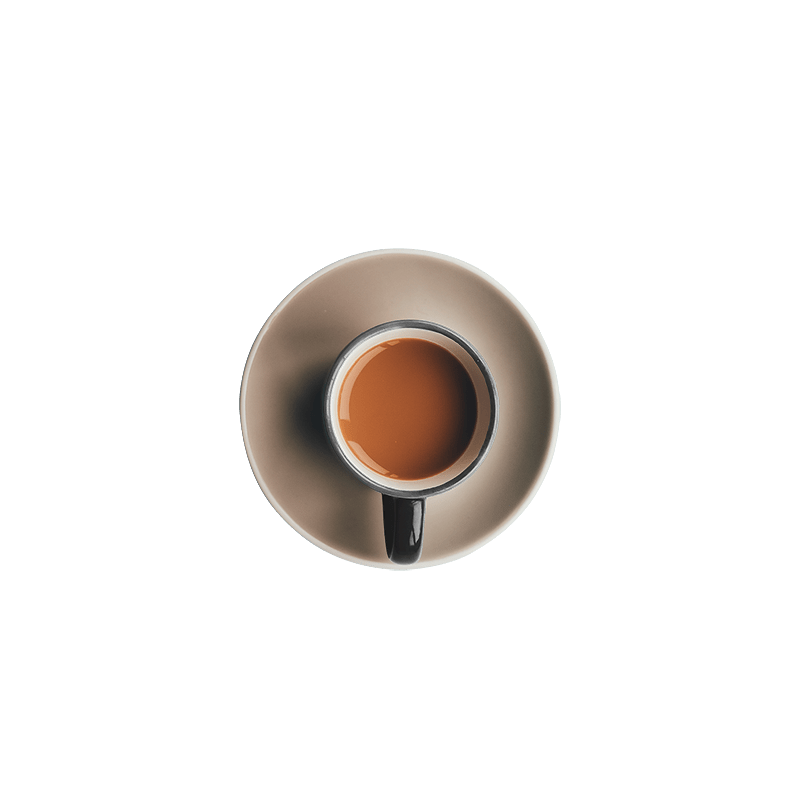
Secondary Colors
SHADE Colors
Lighter tints can be used as background colors to break up content without overpowering it.
